Pages

Monday, November 4, 2013

Use Paper.li to curate online content

I came across this great tool from Adam Cocceri of MathEvolve.com. He shared a publication called iPads in the Classroom that was created using a program called Paper.li. It looked like a great way to distribute blog and Twitter content to non-bloggers and non-Twitterers, which is about 97% of our school district :(. So I created a paper to try it out. I called it the CPS Tech Weekly and in minutes, I had a completed publication. Here's how it works.

First, visit the site at Paper.li. You can either create your own account or link it to your existing Twitter account. Next, create your paper with a title, description, and decide on the publication frequency. When that's done, you can move on to choosing content. 

Main toolbar at the top of the screen.

The top toolbar allows easy access to the most important features of Paper.li. You can easily create new papers, see subscribed papers, and manage your account. 

Key Settings
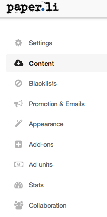
Settings Dropdown
The settings cog gives you the ability to completely manage your paper. The "sources" option lets you choose where you'd like to get your content. More on that in a second. 

You can also quickly refresh your paper by pressing the "fetch new content" button. This will update your paper with the latest and greatest news. 

The "content" option lets you choose what categories you'd like to include in your paper. This was an important find for me. More to follow.

The rest of options seem more advanced to me, mostly because I'm not looking to make money. I just want to help spread amazing knowledge to the teachers of my school district. Of course, the appearance option is nice, but don't get too excited. There aren't a lot of options. You need premium for that. 


Adding Sources
Adding the content you want to your paper is simple. Choose the setting cog in the upper right and choose "sources". You'll get an easy to use menu where you can search for blogs, twitter accounts, hashtags, or suggested publications from popular sources. Simply press the "+" to add it to your paper. The sources you choose appear in the right column. You can easily filter content within a source by choosing the filter option or delete it. 
Adding sources to your paper.

Alright, press "done" and get back to your paper. You might have to choose the "fetch new content" option to get up to date. But when you do, you'll get the first glimpse of your publication. Now you can start to make some changes. There isn't a lot you can do (or I haven't found out how yet), which is a bit disappointing. One nice feature is that you can move your top article to the featured position. Just press the up arrow on the article to move it up. Otherwise, I haven't found a way to move other articles around to more desirable positions. I think that's a part of the premium edition. 

Press the up arrow to move the article to the featured location


Now if you're like me, you'll be worried because there are so many different headings in your paper. Too much going on. Way more than I wanted. It took a few minutes, but I found out how to change that. If you go back to the settings dropdown menu, you'll see the option for content. Press that and you'll get a new page. On the bottom of the page, you'll see options for covered topics. That's where you can deselect options that you aren't covering in your paper. 

The last thing that I've really enjoyed is the Paper.li bookmarklet. You can access it from the same content page you were just on. Drag and drop it to your browser. I use Chrome, and it worked very well. Now when you want to add a specific page to your paper, just press the bookmarklet and choose the right paper. A cool feature of using the bookmarklet is that it sends the resource to the top of your page. 
Bookmarklet

That's about it. When your paper is ready, just send out the link via email, Twitter, your website, or any other vehicle. It's really easy for viewers to subscribe and get notified when your paper is ready. Paper.li is a great option for teachers to distribute current events to students, IT people to spread integration ideas, or for compiling blog posts from your students into a neat little paper. Give it a shot! 


Wednesday, October 16, 2013

Handy Mac Shortcuts

Now that there are many more Macs in the district, it's nice to know a few tips that will help you work more efficiently. I think you'll find that your Mac will do everything the PC does and more. You just have to know what to push. Here's a short list to get you started. 

Quick Search: Command-Spacebar
Use this shortcut to launch smart search. You’ll get a search bar in the upper right corner. Type in the application, email, whatever you’re looking for, hit enter to launch


App Switcher: Command-Tab
Will show all your open applications on a pop-up screen. Arrow over to access an application. Hold Command and press Q to close the applications.


Close Applications: Command-Q
Pressing the red X doesn’t completely close applications. Use this shortcut to close the application when the name is listed on the top toolbar.


Copy: Command-C


Paste: Command-V


Cut: Command-X


Screenshot: Command-Shift-3
Takes a shot of the entire screen


Controlled Screenshot: Command-Shift-4
Gives you crosshairs to click and drag over selected area. Sends the file to your desktop as an image.


Force Quit: Command-Option-Escape
Opens a window so you can choose to force quit an application


Trashing items: Command-Delete
Select an item and use this shortcut to send it to the trashcan

Tuesday, August 27, 2013

Use Tweetdeck to Pre-Tweet your day

Twitter is starting to spread rapidly through our district this year. Yes! More and more classrooms are taking to Twitter to share what they are accomplishing each day. We have one school, Parkade Elementary, with every classroom signed up with their "Follow Me" campaign. It's a great initiative. As a parent, wouldn't you love to be able to get a wider glimpse inside your child's classroom?

One obstacle to getting your tweets out during the day is a fundamental one. You're teaching. It's tough to set aside tweeting time, especially with how quickly things change during the day. So why not get all your next day's tweeting done the night before? It's not as crazy as you'd think. Tweetdeck is the answer.

Tweetdeck is a web application or a program to download to your computer. You must create a Tweetdeck account. I'd suggest using your same Twitter credentials if you can. Then you can add your existing Twitter account once you are logged in. A couple of features make Tweetdeck a handy tool. First, you can set up different columns of information to match your needs. Set up a column to follow a particular user, hashtag, or keep track of your mentions. It's just another way of managing your tweeting world. 

But my favorite part of Tweetdeck is the tweet scheduler. Press the familiar blue button to compose your tweet. Include all your regular content (text, images, links). Then instead of tweeting right now, press the little clock icon in the bottom left side of the composer box. Then choose the exact day and time you want your tweet to be sent. Press "tweet". Your scheduled tweet then moves to the far right column in Tweetdeck while it waits for the designated time to arrive. If things get crazy and your schedule changes, you can delete the tweet before it goes out.

As a classroom teacher, I would pre-tweet three or four activities, objectives, or events for the next day and set them to send during the activity. That way parents can get a real-time look at what's going on. It's so much better than rattling off a rash of tweets right after dismissal each day. And if someone challenges you about tweeting during instructional time, you can educated them about the power of Tweetdeck. You know, a learning opportunity. 

Friday, April 5, 2013

Skype's "online dating" for educators


Skype has been around for a long time and is a great tool to connect for free with people all over the world. Which is a great thing if you know who you want to talk to and have a way to set up a meeting. What you got out of it was all about who you knew. But what about for all of those teachers out there who want to connect with other teachers, experts, or guest speakers, but don't have connections? Well, now you do. 

I call it "Online Dating with Skype". 


First, visit Skype's Education page. You can use your existing Skype account to sign up for a profile. Once you are in, you have access to all types of resources. Basically, once you find someone who fits your curriculum needs, you contact that person through Skype in order to plan out your learning objectives and set up a time to call. That easy. 

Here's a rundown of how you might search for contacts:

Skype Lessons
This is the meat of Skype Education. You can search for existing lessons by dozens of content areas. You'll see the "online dating" aspect at this point. For each lesson, the teacher can request who they are looking for. For example, one lesson might say "looking for a classroom of 16-18 year-olds to discuss the Civil War". You can also create your own lessons to invite other classrooms to contact you. 

Partners
Businesses and organizations are connected here. There's quite an array of partners already: Penguin Books, Virginia Historical Society, NASA Digital Learning Network, Microsoft, and the National Museum of the Royal Navy to name a few. Most already have several lessons uploaded and ready to use.

Collections
Looking for a set of resources? Try looking through collections. You'll find categories of lessons here. There are some great collections ready for you now. Mystery Skypes, Out of this World, Culture Clubs, and Global Food are just a few examples. Content that is ready to use right now. 

That should be enough to get you started. I've really enjoyed sharing this resource with my teachers. I think it turns the Skype "black hole" into a resource that can be beneficial for supporting any teacher's instruction.


Friday, March 1, 2013

PBL Tool: Infographics

Tired of having the students complete the same projects year and after? I know that is something that we all feel from time to time. I'm starting a series of posts that are dedicated to showing new project options for your students to use. My goal is to offer a menu of ideas for students to reference when they are determining the best tool for sharing their knowledge. So let's get started.

Let's talk infographics today. Chances are, you've seen an infographic before and haven't noticed it. In case you haven't, or to refresh your memory, here's the basic idea behind an infographic. Infographics are visual representations of information that could include data, information, knowledge. It's also a great way for students to identify trends and offer their own perspective on quantitative information. 

There are three parts to the infographic: visual, content, and knowledge. Here's a breakdown of each element.

Visual - consists of two types of graphics, theme and reference. The theme is the overall visual representation of the information. Reference graphics consist of icons that steer viewers to important information.

Content - usually consists of statistics and facts about the topic.

Knowledge - Contains insights and analysis of the content. It's the most important part because it shows the thinking of the student. Anyone can find facts. We want students to analyze. 

If you haven't seen an infographic before, then let's take a look at a few. Here are some good examples of infographics:

How Laws are Made
Students and Social Media
Twitter Spectrum for Educators

Now that you've seen some examples of infographics, let's look at a few options for how to create them. I would definitely suggest using a web 2.0 tool to create your infographic. The tools are embedded, easy to use, good looking, and free. And once they are created, it's easy to share because the product is web-based. Embed on your site, share the link, or tweet your creation. What's not to love?

Piktochart - A free, web-based infographic creator. Sign up for your account and start building. Lots of templates to choose from and offers drag and drop functionality.

Visual.ly - Another free, web-based infographic creator. Visual.ly offers a searchable database of infographics that were submitted by its users. 

Microsoft Publisher - Simply enough, make a Publisher document. You'll have to do a lot of work because you'll start from scratch. And it probably won't look as cool. 

I hope that's enough to get you started. I think infographics are a great way to share student knowledge. Try it out and let me know what you think. 


New look for Google Forms

Google has done it again. When I went in to create a new Form for a training session, I saw that changes have been made to the process. Overall, I think they are improvements that will make it easier for folks to use the forms more efficiently. 

The change you notice first is with the Form interface. It's a cleaner look and utilizes the toolbar more than before. To add content to your Form, you now have to choose "insert" from the toolbar. Simple enough. 

A new feature that I really like is the easy access to your Form's confirmation message. I remember stumbling upon it a few times in the old view, but it was out of site, and therefore out of mind. With the new look, the confirmation message is sitting at the bottom of the editing page. 


This new placement makes is up front for the creator. You can now quickly add your closing message. Another feature (it might not be new, but it's new to me) is the ability to send users to view the overall results. If you check the box to publish the link, people who finish the Form can choose to view the current results. A nice addition. 

Although I'm only speculating, it seems the biggest change was meant to end a problem with the old version of Forms. Before, it was easy to share the wrong link with your audience. If you've used Forms before, then chances are you've made the mistake of sharing your results spreadsheets instead of the live Form. Google takes care of this issue with the updates. There is no "save" button anymore. It now says "send form". Here's a look at the options you get.


Now the link to share is front and center. Simply copy and paste into your email, website, tweet, or other means to share. 

The last change I like is the ability to separate your Form from the results. You now have the option to view the responses in a new Spreadsheet or from within the Form. If you choose a new spreadsheet, Google creates another document and labels it so you know which is which. 


Now I have one document that is my actual Form and another that houses my results. Pretty nice indeed. Then you can clearly share the results of the Form with your collaborators.

The one aspect of Google that I really like and admire is their willingness to modify their products. It's funny how one day I'll say, "I really wish Google would..." and find out the next day that they made the changes I wanted. It really adds a lot of credibility to the famed Google 20% time and the impact it has on its product. No wonder so many companies and schools are starting to adopt a similar structure. 


Friday, February 15, 2013

Post to YouTube via email

This is an awesome tip I got from Lucy Gray (@elemenous) at this week's METC conference in St. Louis. Lucy presented a session called "Exploring Instructional Uses of Multimedia". Be sure to check her website High Techpectations for other great ideas. In this post, I will show you how to upload a video to your YouTube channel through a process called mobile uploading. 

Let's start with an instructional scenario. You have students working on a campaign project in your government class. Student groups are working to create a 30 second video ad for their candidate. You have groups working on iPads, smartphones, and other devices. When they are finished, you want to gather and share these projects in the easiest manner possible. So why not have them email them directly to your classroom's YouTube channel?

Here's how you get it done. The hardest part of the process for me was finding my channel's email address. After a bit of digging, I found the easiest way. Once you are signed in, click on the tiny arrow next to your name in the upper right corner of the screen. That should open up your options. Choose "YouTube Settings". See below.


From there, you'll see your account information. Below your name and password, you'll see "mobile uploads". You're going to get a crazy long email address that ends with the domain @m.youtube.com. If you think like me, you'll want to press the little button that says "click here to get a new address" so you can change it to something easy. Alas, all it does is give you another crazy long email address instead. So having your students enter the correct email address is likely the hardest part of the process. I'll admit I messed it up a few times. 

On the mobile device, open up your video and email it to that address. The first time I did it, I got a confirmation address from YouTube. Since then, I haven't. So don't expect it every time. And don't expect it to come quickly. Some of my tests took up to five minutes to appear. But it's going through several locations, so I guess I should just be amazed that they appeared at all. 

Now that the videos have been uploaded, you can now manage them and move them to an appropriate playlist for classroom use. You'll have all the great features that YouTube offers, but with the added convenience of having the videos uploaded directly from any device. That's pretty cool.